The Top 5 Brand Colors That Make Your Website Stand Out
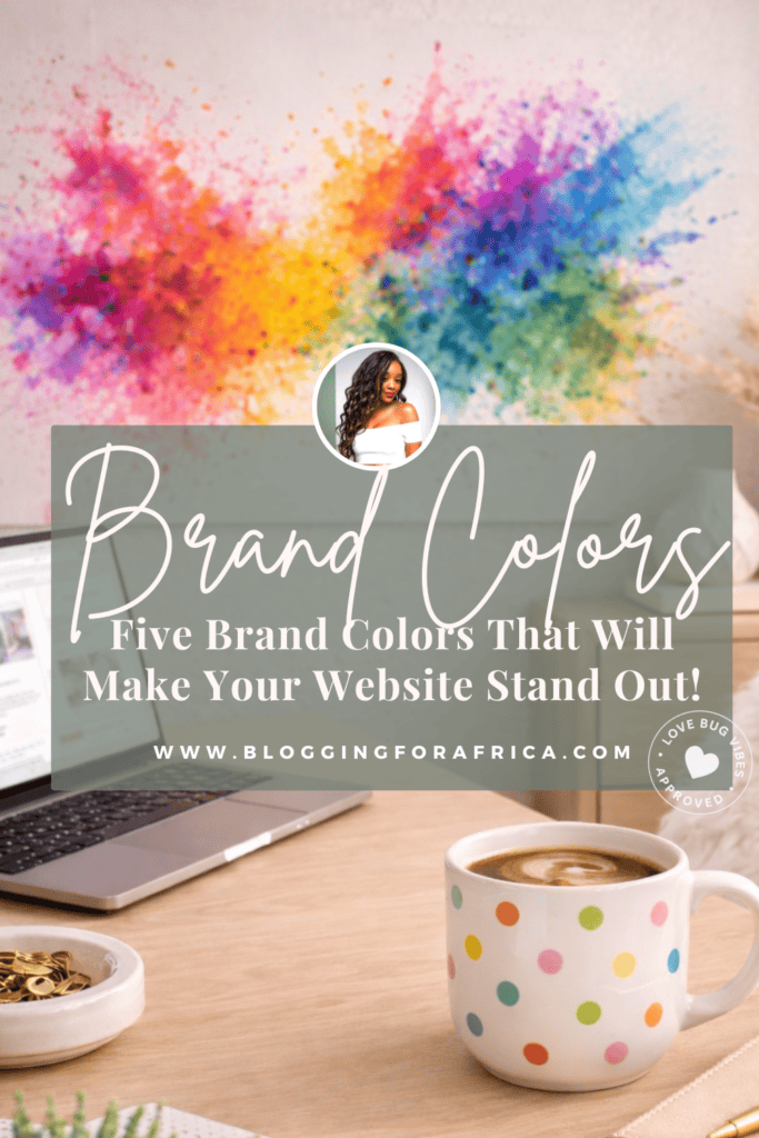
The Top 5 Brand Colors That Make Your Website Stand Out (and What the Data Is Showing Right Now)
When you think about website design… what comes to mind?
You’re probably thinking:
• Website pages
• Copyright
• Nice visuals
• Product pages
And while all of those are important…
Here’s a little secret.
In order to create a design that stand out, it’s going to come down to brand colors.
But why are brand colors important?
And how do they fit into your website design?
Well, that’s what we’re breaking down in this post.
So you can have a website that not only looks good, but feels good and converts.
Okay love bug…before we dive in…
Grab your coffee, your tea, or your favorite drink, and let’s get into it ☕️
Colors = Energy
One of the things that is super important—and something we’ll talk more about in upcoming blog posts—is the color of your website.
Every color gives a certain feeling, brings a certain energy, and creates a certain environment that you want your website visitors to have when engaging with your brand.
So when choosing the color for your brand, you want to consider how you want your audience to feel about your brand and your products and services when engaging with your website.
That experience is important.
And the right brand colors can make everything else you do—whether it’s in person or on your website—feel easier when it comes to trust, service, and conversions.
✨️ Enjoying this post? Make sure you pin this to your Pinterest board—these brand colors are going to completely change how you design your website.
1. Blue
So, let’s talk about the color blue.
When most people think about blue, there’s a lot that can come to mind—but one thing it consistently gives is a sense of trust.
Blue naturally carries a feeling of consistency, stability, and reliability.
It has a steadiness to it that makes people feel a little more at ease the moment they land on your site.
And here’s something a lot of people don’t always think about…
With the color blue—especially darker tones—it can also give a subtle touch of luxury.
The Psychology
Blue typically signals trust, clarity, professionalism, and even a hint of elegance.
So if you’re a brand that wants to convey safety, reliability, and trust at its core—through your message and your products and services—blue is a color you’ll want to pay attention to.
Especially if that’s the feeling your audience needs to experience when they interact with your brand.
Where You’ll See It
You’ll see blue across a lot of industries—and that’s not by accident.
It tends to show up in spaces where trust, clarity, and professionalism matter most.
Think tech brands, healthcare, service-based businesses, and more corporate environments where people need to feel a sense of stability and security before they move forward.
Anywhere the goal is to create a smooth, reliable experience—blue usually plays a role.
What the Data Is Showing
Blue continues to lead when it comes to trust and preference across brands.
Around 42% of people worldwide say blue is their favorite color, making it the most preferred color globally. (Sources)
Studies show that over 50% of consumers associate blue with trust, reliability, and security in branding. (Source)
Blue doesn’t just look good—it’s one of the most trusted colors you can use.
Light Blue vs. Dark Blue
Okay, love bug, something to keep in mind is the shades of blue—because all shades don’t give the exact same feeling.
So here’s what you need to know.
Darker blues feel more established, refined, and intentional — think Samsung.
Lighter blues feel softer, calming, and more elevated — think Tiffany & Co.
And even lighter shades, blue can feel more playful and youthful, which is why it’s often used in children’s and toy brands.
A Quick Note on Blue
When it comes to blue, as amazing as it is and how well it works for many brands, you still want to be sure it works for you.
Make sure it actually aligns with your brand’s personality.
And also pay attention to how you’re using it—sometimes your website doesn’t need to be fully blue, it may just need a pop of it.
2. Green
Now let’s talk about the color green.
When you think about green, what comes to mind?
For most people, it’s things like grass, nature, maybe even your favorite tea—things that feel fresh, calm, and easy.
And that’s exactly the feeling it brings.
But beyond that, it also gives a sense of stability and comfort.
And depending on how it’s used—especially in deeper tones—it can give a subtle hint of luxury.
Green is one of those natural colors that just feels like growth.
It tends to create a sense of relaxation and calm, but at the same time, it carries this quiet energy of growth, new beginnings, and real possibility.
Green is one of those colors that gives you a quiet burst of energy and creativity—with zero overwhelm.
The Psychology of Green
Green typically signals growth, balance, and alignment.
It’s often associated with renewal, fresh starts, and a sense of forward movement. There’s also a grounded, steady energy to green that makes it feel calming and reassuring.
For brands, green works especially well if your brand’s mission is rooted in progress and clarity.
What the Data is showing
Using consistent color in branding—including green—can increase brand recognition by up to 80%, making it one of the most powerful visual elements a brand can use. (Source)
Around 70% of consumers identify as environmentally aware, which is a demographic often aligned with brands that use green in their branding and positioning. (Source)
Shades of Green
Something to keep in mind is that not all shades of green give the same feeling.
Darker greens tend to feel more grounded, more elevated, and can lean a little more into that luxury feel — think Rolex.
Lighter greens, on the other hand, feel more fresh, soft, and calming—often giving a more natural and easygoing energy —Think Whole Foods
And then you have those brighter greens, which can feel more vibrant, energetic, and attention-grabbing — something like Spotify.
So when choosing your shade of green, it really comes down to the exact feeling you want your brand to have.
Quick Note on Green
If your brand leans toward a calm, balanced, and creative feel, green can be a strong fit.
And sometimes, a full green palette isn’t needed—a splash of it can be enough.
✨️Getting ideas already? You’re going to want to save this. It’s one of those posts you’ll come back to when choosing your brand colors.
3. Neutral Colors (Black & White)
Two colors that I personally love working with as a website designer are black and white.
Now, I will say—most websites won’t rely on just black or white alone. There are usually other colors layered in.
But when used effectively, these two can absolutely stand on their own—white for a clean, minimal feel, and black for a more bold, statement-driven look.
Where You’ll See It
You’ll often see black and white used across brands that lean into a more minimal, editorial, or high-end look.
Think industries like fashion, luxury, personal brands, and modern service-based businesses that want to feel clean, structured, and elevated.
Black and white is also commonly used in brands that want their content, messaging, or visuals to stand out without distraction.
Shades of Neutral (Black & White)
When it comes to black and white, it’s less about “shades” and more about how each one is used.
Black tends to feel more bold, more defined, and more statement-driven — think Chanel.
White, on the other hand, creates a more clean, minimal, and open feel — something like Apple.
So when choosing between the two—or using them together—it really comes down to the exact feeling you want your brand to have.
The Data
Black is commonly used in branding to signal luxury and sophistication, while white is strongly associated with clarity and simplicity.
Simpler color schemes—like black and white—have also been shown to improve focus and readability in design. (Source)
Something to keep in mind
When it comes to black and white, you want to be clear on how you’re using it.
If you’re leaning more into black or white as your primary tone, it should feel intentional and aligned with your brand.
And if you’re pairing it with other colors, those combinations should work seamlessly together.
4. Pink
When you think, you probably think soft, feminine, and expressive—and all of that is true.
Pink has a way of bringing warmth, personality, and a sense of emotion into a brand.
It feels inviting, a little playful, and depending on how it’s used, it can carry a quiet confidence that naturally stands out.
The Psychology
Pink is often associated with optimism, warmth, and women-focused brands.
It brings a sense of emotion and connection into a brand, making it feel more personal, expressive, and inviting.
Depending on the shade, pink can feel soft and nurturing—or bold and confident—but at its core, it creates a sense of approachability.
Pink also has a unique way of making a brand feel felt, not just seen.
Where You’ll See Pink
Pink shows up across a wide range of brands—but how it’s used makes all the difference.
You’ll often see it across beauty and skincare brands, wellness and self-care spaces, creative businesses, and personal brands that lean into emotion and connection.
But beyond the industries themselves, pink is often used by brands that want to feel approachable, expressive, warm, and personality-driven.
Shades of Pink
When it comes to pink, it’s easy to think all shades are the same—but they’re not.
Different shades of pink create different responses, speak to different people, and set a different tone for your brand and your website.
So the shade you choose matters just as much as the color itself.
So here are a few pink shades to consider.
A darker pink can feel richer, a bit more refined, and slightly elevated.
A softer pink can feel gentle, calm, and nurturing—or even light and playful, depending on how it’s used.
A brighter pink can feel bold, expressive, and full of personality.
Each one creates a different kind of experience—so it’s not just about choosing pink, it’s about choosing the right pink for your brand.
The Data
Rapid Adoption: Between June 2022 and May 2023, the proportion of small businesses creating pink logos increased by 46%. (Source)
Low Overall Usage: Despite this growth, only about 3% of professionally designed websites and logos use pink—making it a strong differentiator when used intentionally. (Source)
Something to Keep in Mind
Unlike more neutral colors, pink isn’t something you can use randomly—it needs to make sense for your brand.
It sends a clear message, so make sure it’s the right one.
Even a splash of pink can change the overall feel of your website.
✨️Enjoying this post? Make sure you pin this to your Pinterest board—these brand colors are going to completely change how you design your website.
5. Orange
If you’ve ever looked at a website or an advertisement and instantly felt a boost of optimism and energy, it was probably using the color orange.
Orange is one of those colors that naturally feels warm, energetic, and full of life.
It brings a sense of movement, excitement, and creativity without feeling overwhelming.
When you see orange, it often gives off a feeling of positivity, confidence, and forward momentum—making it a strong choice for brands that want to feel both engaging and easy to connect with.
The Psychology of Orange
Orange is often associated with enthusiasm, creativity, and action.
It’s one of those colors that naturally encourages interaction—it feels inviting, social, and engaging without feeling too intense or overpowering.
From a branding perspective, orange is often used by brands that want to feel approachable, energetic, and driven.
It can create a sense of urgency, but in a way that still feels positive and motivating rather than overwhelming.
It also carries a sense of confidence and movement, which is why it works well for brands that want to inspire action while still feeling friendly and accessible.
Where You’ll See Orange
Orange shows up across a wide range of brands—but how it’s used makes all the difference.
You’ll often see it in industries like fitness, food, technology, and creative spaces—especially in brands that want to feel energetic and easy to connect with.
Think Fanta, Nickelodeon, and The Home Depot—each uses orange to create a sense of energy, visibility, and approachability.
It’s also common in brands that want to stand out without feeling too intense, giving it that balance between bold and approachable.
More than anything, orange is used when a brand wants to feel active, inviting, and full of momentum.
The Data
Visibility & Action: Orange is widely used for call-to-action elements because it stands out and encourages interaction—often helping drive higher click-through and engagement rates. (Source)
Brand Recognition: Consistent use of brand colors—including bold choices like orange—can increase brand recognition by up to 80%. (Source)
Something to keep in mind
As beautiful as orange is, it naturally draws attention—so where you place it on your website matters just as much as how you use it.
Bonus: The Color Brown 🥂
Brown is one of those colors that instantly brings a grounded, warm, and homey feel to a brand—especially when it naturally fits.
It doesn’t have to take over your entire website, but when used right, it can add depth and a certain richness that just works.
✨Don’t forget to pin this to your branding or website board—when it’s time to choose your brand colors, you’ll be glad you did.
Conclusion
So if you made it this far, you probably realize just how fun color can be—but also how important it is when building a well-designed, stunning, content-driven website for your business.
In fact, color can be the very thing that makes your website work—or not.
And over here, we’re all about creating websites that work.
So, love bug… choose your colors wisely.
Alright friend, if you loved this post, I already know you’re going to love this one next:
5 Website Design Tips for Traffic and Sales Needed Like Yesterday!
Until next time,
Your favorite foodie and blogger, Keesh.
Was this post helpful? Don’t be shy, share it below! Your shares make a difference ♥️

For Global Business Owners & The Ambitious Creative Entrepreneur:
Unlock my Proven GAB-LC Method – A No-Fluff, Step-by-Step Strategy to Launch Your Blog, Increase Your Website Traffic, and Boost Product Sales - Get Your Free Blog Checklist & Take Action and Start Building Your Blog in Just 5 Days!
Leave a Reply

Unlock my Proven GAB-LC Method – A No-Fluff, Step-by-Step Strategy to Launch Your Blog, Increase Your Website Traffic, and Boost Product Sales - Get Your Free Blog Checklist & Take Action and Start Building Your Blog in Just 5 Days!

Enter email you would like information sent to.
Called To Blog
Free Blog Checklist
You're all signed up! Keep your eyes on your inbox for the information.